A histogram is a way of representing the frequency distribution of a quantity which changes randomly each time it is measured. Most other types of graph are used to show the correlation between different variables. The key difference between a histogram and other types of graph is that there is only one variable and the aim is to show how its values are distributed.
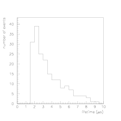
A histogram is similar in appearance to a bar (or column) chart where categories are marked along the x-axis and the height of columns above these categories shows their relative frequency. A bar chart, although it looks similar to a histogram, has discrete categories on the x-axis rather than a continuous variable. The x-axis of a histogram represents a quantity which is continuous, but the the axis is still divided into bins. The column heights in each bin show the relative frequency of data with a value between the lower and upper edges of the bin. Figure D.6 shows an example of such a histogram.
Histograms are typically used to show data which are collected by repeated measurements of a quantity whose value varies according to some probability density, such as the lifetime of an unstable nucleus or particle before it decays.
|